

UX DESIGNER
·
3 MONTHS
·
SHIPPED
Designing an accountable
AI diagnostic workflow
I redesigned the core diagnostic workflow and its supporting systems for access management and model configuration—so teams could understand complex work, track case status, and make high-stakes decisions with clear evidence.
ROLE
UX Designer
SCOPE
Workflow, IA, interaction, visual system
COLLABORATION
Product, engineering, stakeholders
DELIVERY
AI-assisted responsive prototype + handoff
MOTION 01 · DIAGNOSTIC WORKFLOW
collect → diagnose → review
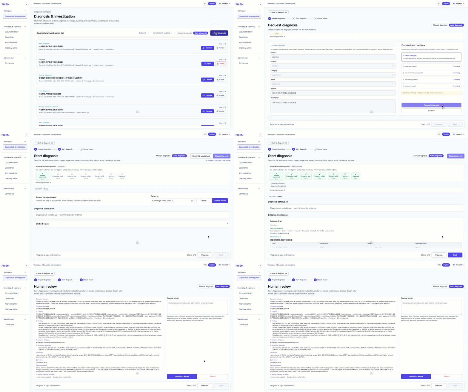
A time-compressed view of the workflow: evidence collection progresses into diagnosis and a clear handoff for human review.
UX DESIGNER · 3 MONTHS · SHIPPED
Designing an accountable AI diagnostic workflow
I redesigned the core diagnostic workflow and the supporting systems for access management and model configuration—so teams could track complex work and make accountable decisions.
ROLE
UX Designer
SCOPE
Workflow · IA · interaction · visual system
COLLABORATION
Product · engineering · domain stakeholders
DELIVERY
AI-assisted responsive prototype + handoff
MOTION 01 · WORKFLOW
Auto diagnosis progresses into a reviewable report.
01
CONTEXT & CHALLENGE
The challenge was not adding more UI. It was making a complex system legible.
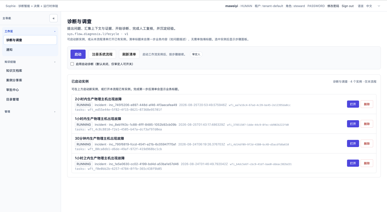
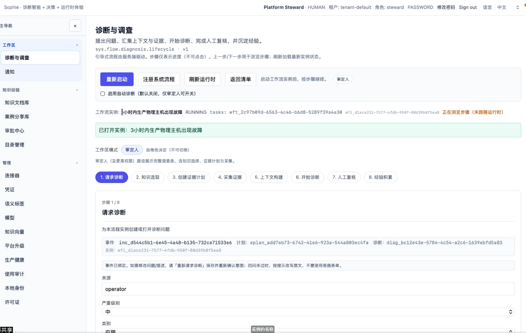
The original demo exposed technical detail before users understood where they were, what the system was doing, or who needed to act next.
01
Weak information hierarchy
Dense system data competed for attention, so users could not identify a clear visual center.
02
A long, approval-heavy workflow
Case status and responsibility became difficult to track across eight dependent steps.
03
A steep configuration threshold
First time setup and daily maintenance followed different mental models but appeared as one undifferentiated page.
01
CONTEXT & CHALLENGE
Make a complex system legible.
The original demo exposed technical detail before users understood where they were or who needed to act.
ORIGINAL DEMO
Evidence for challenges 01–02
Dense metadata competed for attention, while "Running" did not explain the current step or next action.
01
Weak information hierarchy
Dense system data competed for attention.
02
Long, approval-heavy workflow
Status and responsibility were hard to track.
03
Steep configuration threshold
First-time setup and maintenance looked identical.
02
DESIGN STRATEGY
Rebuilding the page around the user's next decision
The original demo exposed system structure. The redesign made task priority, context, and next actions visually unmistakable.

BEFORE
System structure dictated the page
Controls, metadata, and steps competed for attention.
Restart
Register flow
Refresh
Back
Mode
Runtime metadata and system IDs
Eight equal-priority workflow steps
Task context mixed with implementation details
Long scroll · weak focal point · unclear next action

AFTER
The user's decision dictated the page
Context stays visible while one clear action moves the case forward.
Page title + one-sentence orientation
Persistent progress and case status
Evidence / report context
Decision panel

Required action
Step 7 of 8
Save · Back · Continue
1
One focal point
Primary task and primary action lead the visual hierarchy.
2
Context without scrolling
Master-detail and split-panel layouts keep reference material in view.
3
Persistent orientation
Progress, state, and next step remain visible throughout the case.
02
DESIGN STRATEGY
Rebuilding the page around the user's next decision
The original demo exposed system structure. The redesign made task priority, context, and next actions visually unmistakable.
BEFORE
System structure dictated the page
Controls, metadata, and steps competed for attention.
Restart
Register
Refresh
Back
Runtime metadata and system IDs
Eight equal-priority workflow steps
Task context mixed with implementation details
Long scroll · weak focal point · unclear next action
AFTER
The user's decision dictated the page
Context stays visible while one clear action moves the case forward.
Page title + one-sentence orientation
Persistent progress and case status
Evidence / report context
Decision panel
Required action
Step 7 of 8
Save · Back · Continue
1
One focal point
Primary task and action lead the visual hierarchy.
2
Context without scrolling
Split views keep reference material in view.
3
Persistent orientation
Progress, state, and next step remain visible.
03
DIAGNOSTIC WORKFLOW
Users had to decode the system before they could move a case forward.
Two structural changes reduced upfront input and preserved context through the workflow.
01
DESIGN MOVE 01
Ask only for what is needed now
Reduce the entry screen to essential problem framing, readiness checks, and one primary action.
Result: a focused entry point instead of a technical control surface.
Request
Knowledge
Evidence
Review
Problem + intent
Describe the issue
Severity · Category
Readiness
Required action
One clear next step
Step 1 of 8
Save · Continue
02
DESIGN MOVE 02
Preserve context through the workflow
Use master–detail and split-panel structures so reference material remains visible while users select and decide.
Result: less scrolling and fewer context switches.
Persistent progress + case status
Select
Source A
Source B
Source C
Evidence / document context
Preview and supporting details
Decide without losing reference material
03
DIAGNOSTIC WORKFLOW
Users had to decode the system before they could move a case forward.
Two structural changes reduced upfront input and preserved context through the workflow.
01
DESIGN MOVE 01
Ask only for what is needed now
Reduce the entry screen to essential problem framing, readiness checks, and one primary action.
Result: a focused entry point instead of a technical control surface.
Request
Knowledge
Evidence
Review
Problem + intent
Describe the issue
Severity · Category
Readiness
Required action
One clear next step
Step 1 of 8
Save · Continue
02
DESIGN MOVE 02
Preserve context through the workflow
Use master–detail and split-panel structures so reference material remains visible while users select and decide.
Result: less scrolling and fewer context switches.
Persistent progress + case status
Select
Source A
Source B
Source C
Evidence / document context
Preview and supporting details
Decide without losing reference material
04
USER-CENTERED ADMINISTRATION
One user workspace replaced two disconnected admin tools.
The original product separated user records from effective permissions, forcing administrators to switch tabs, remember identities, and reconstruct access. The redesign made the user—not the permission object—the primary unit of navigation.
1 · Select a user once
2 · Assign or remove roles
3 · Inspect effective permissions
BEFORE · TWO DISCONNECTED VIEWS
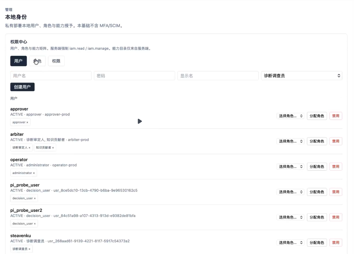
User records and role assignment
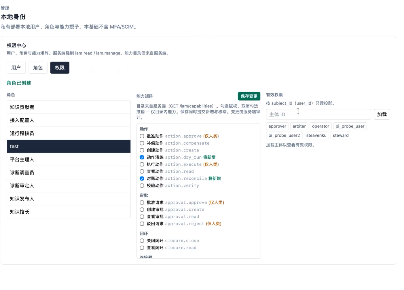
Effective permissions required a separate tab and subject lookup
AFTER · ONE USER-CENTERED WORKSPACE
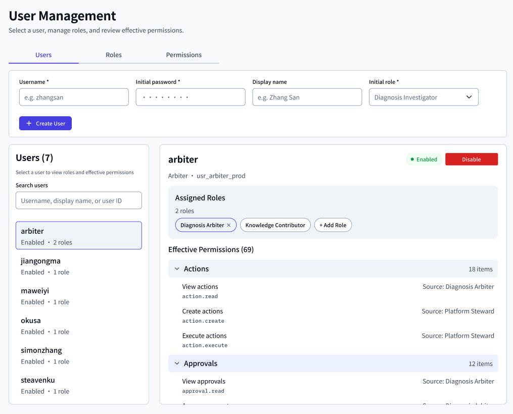
Select a user, assigned roles and effective permissions remain visible in the same master–detail workspace.
04
USER-CENTERED ADMINISTRATION
One user workspace replaced two disconnected admin tools.
The original product separated user records from effective permissions, forcing administrators to switch tabs, remember identities, and reconstruct access. The redesign made the user—not the permission object—the primary unit of navigation.
1 · Select a user once
2 · Assign or remove roles
3 · Inspect effective permissions
BEFORE · TWO VIEWS
USERS
PERMISSIONS
AFTER · ONE WORKSPACE
Select once; roles and effective permissions stay together.
Usernames anonymized for confidentiality.