Custard's Diary ——
Designing a zero friction
photo diary that updates itself

iOS Photos is built for browsing thousands of images. It isn't built for answering the question: "What was Custard doing on any specific day?
I had hundreds of meaningful photos trapped in an app designed for everything — which meant it was genuinely optimized for nothing. Native Photos is a storage tool. What I needed was a diary: something that preserves chronology, surfaces memories by date, and stays shareable without re-sending files each time.
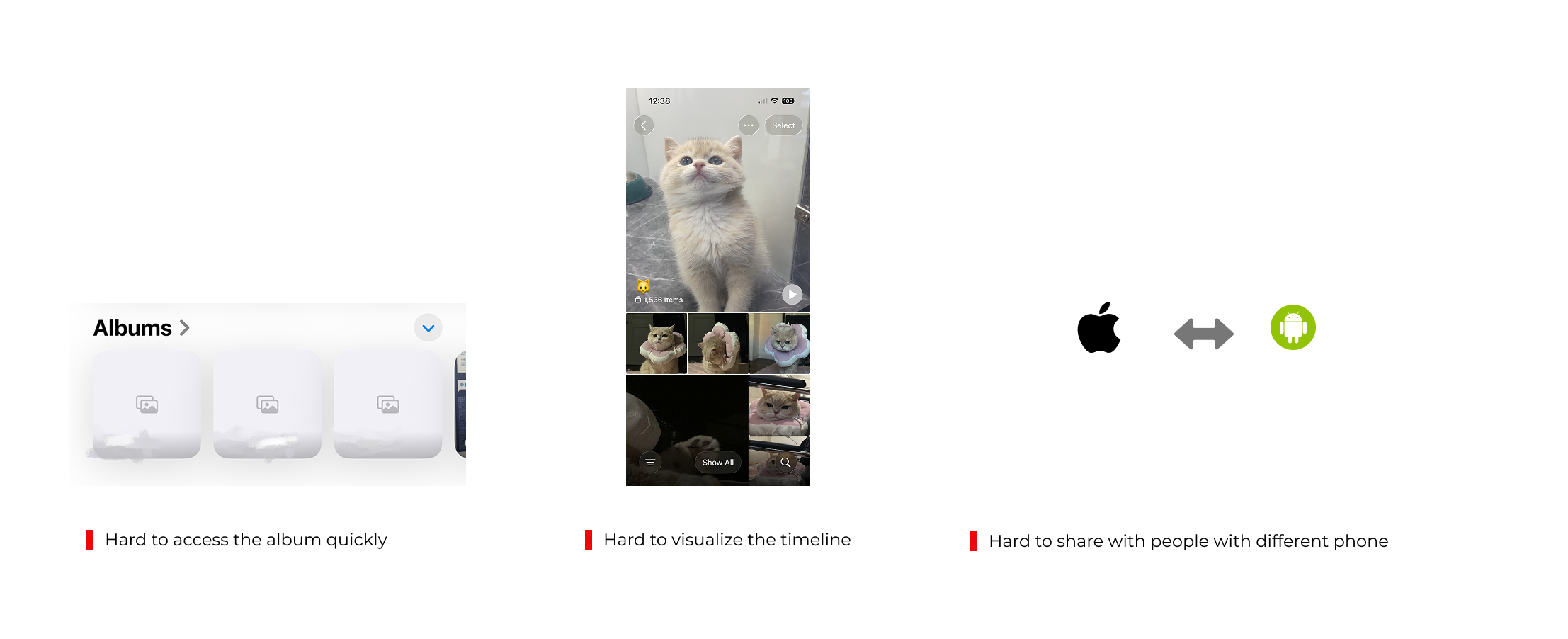
The key insight was distinguishing two different behaviors: capturing (which I was already doing every day) and retrieving + sharing (which required too much effort to be sustainable). The product needed to collapse the second behavior to near zero.
The product only works if it's consistently maintained. That means the upload experience can't rely on any action from me — it has to happen automatically.
I want to navigate by date — "show me February" — not search by tag or scroll through a feed. The mental model is a diary, not a gallery.
One persistent URL, always up to date. No re-exporting, no attachment. Anyone can check in at any time.
① Calendar grid, not timeline, not a pure feed

Considered: chronological timeline scroll · Instagram-style feed · traditional photo grid
A linear timeline is space-inefficient. You scroll through empty stretches of time just to reach the next photo. A pure feed loses date awareness entirely: you can’t tell at a glance what month or day you’re looking at.
The calendar preserves time structure while remaining scannable. I kept the Instagram-style gallery within each dat, so you get the browsing experience of a feed once you drill in, but the navigation clarity of a calendar at the top level. Best of both formats.
| FORMAT | TIME AWARENESS | SPACE EFFICIENCY | BROWSING UX |
|---|---|---|---|
| Timeline scroll | High | Low — lots of empty space | Linear, heavy scrolling |
| Instagram feed | Low — dates buried | High | Familiar, browsable |
| Calendar + gallery within date CHOSEN | High — month at a glance | High — variable card density | Calendar to navigate, feed to browse |
② Variable card size based on photo density

Considered: uniform grid · size by importance · random masonry
Days with 8 photos get a larger card; days with 1 get a smaller one. This isn’t just a visual preference, it’s an information design decision. The size signals activity level before you read a single number. You can scan the calendar and immediately see “this was a busy week” vs. “quiet few days” without counting anything.
Days without photos stay visible as empty cells rather than disappearing — preserving the calendar’s time continuity while remaining visually quiet.
③ Auto-upload as core product behavior, not a feature
Considered: manual upload to web · iCloud share shortcut · batch export monthly
WHY AUTOMATION IS THE KEY UX DECISION →A diary only works if it’s actually maintained. The hardest design problem I solved wasn’t on screen — it was removing the behavioral requirement entirely.
I built an iOS Shortcut that: filters photos from a dedicated album, converts them to web-optimized JPG, uploads to Supabase Storage, and organizes by date — automatically, every day. The user (me) never has to think about uploading. The product maintains itself.
The most important UX decision I made wasn't a screen design, it was the data pipeline. Designing for zero behavioral friction meant designing the invisible infrastructure, not just the interface.

Growing daily since launch
Shortcut runs automatically
No re-exporting needed
Currently, the product has a few users including me and my parents since launch. No maintenance reminders, no backlog of unuploaded photos. The pipeline design decision is the reason this works: every other format I considered would have required occasional manual work, which I know from experience I wouldn't sustain.
This project pushed me past interface design into systems thinking — how data moves, how authentication works, how different components of a product interact. Building something I actually use every day made the UX stakes real in a way that design exercises don't.
The most transferable insight:
"Great UX isn't only about beautiful screens — it's about designing the invisible infrastructure that makes behavior effortless. The hardest and most important design decision I made here wasn't visible in any mockup."
Working with Lovable also shaped how I think about the design–engineering boundary. Describing the product in precise enough terms for the AI to implement it correctly forced me to think more rigorously about interaction states, data models, and edge cases than a typical design handoff would. This project pushed me past interface design into systems thinking: how data moves, how authentication works, how different components of a product interact. Building something I actually use every day made the UX stakes real in a way that design exercises don't.