Map legend accessibility project
Project Overview
This is a project I worked on independently during work, aimed at improving the accessibility of the map in various ways to ensure it is visual disability-friendly.
Why it’s important and how we start?
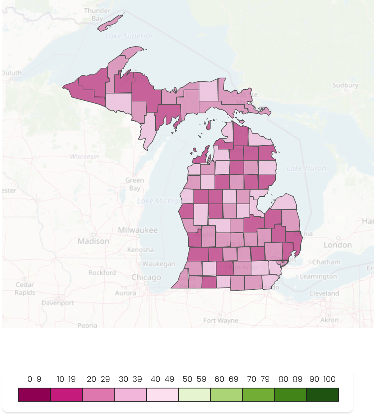
As we design a new school building-level map view, we plan to introduce geolocation-based markers for each school to provide users with access to granular data. Currently, we used the same divergent color scheme as in version 1, assuming it would be familiar to users, but time constraints prevented us from exploring other options. However, during usability testing, we received feedback about confusion with the current color coding.As a result, we decided to explore ways to improve accessibility for the map legend.
How we went about this?
To increase accessibility, we focus on color and marker.
To enhance data readability, we explored and visualized both unified and multi-shape marker approaches. A SWOT analysis was then conducted to inform our selection of the most effective solution.
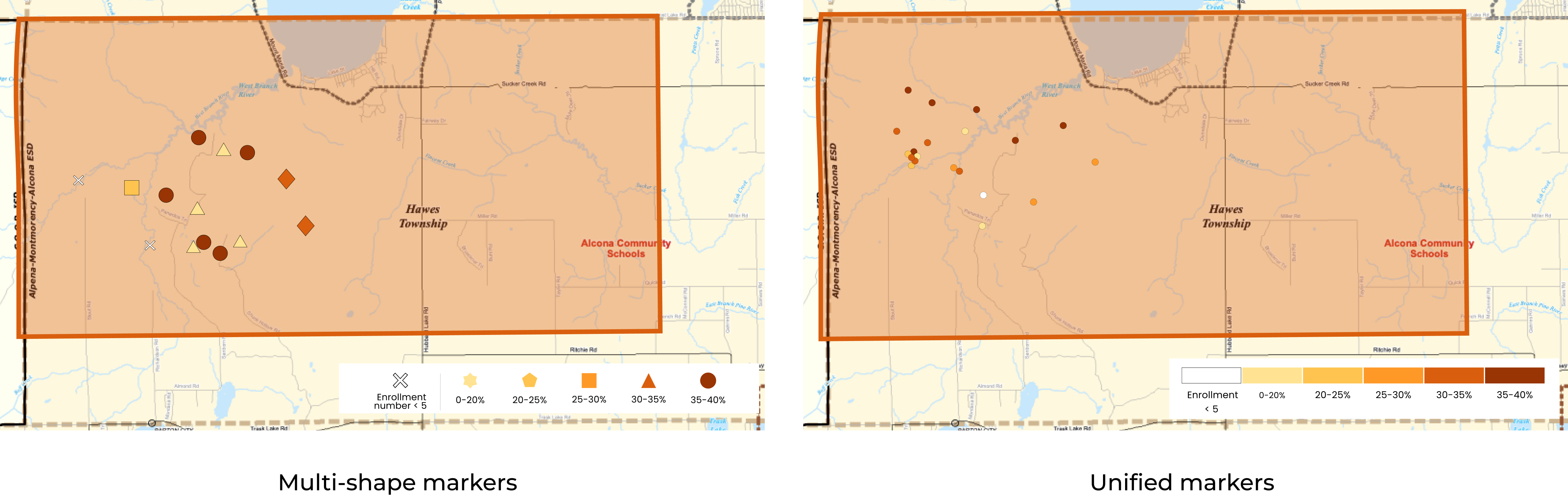

As we’ve determined that a unified marker is the most appropriate visual choice, we need to consider how to maintain accessibility at the individual school building level. How can we ensure all users can easily access specific details for each school, even without varied marker shapes?
Adding interactive elements
This is perhaps the most crucial method for providing detailed, accessible information without cluttering the map.
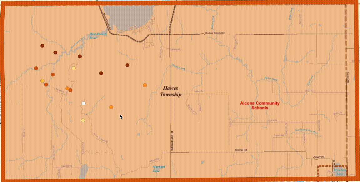

By incorporating interactive features, we effectively preserve the accessibility of these markers.
To ensure our maps are accessible to all users, including those with color vision deficiencies, we evaluated various color schemes. By simulating different types of color blindness and analyzing the perceptibility of each palette, we identified the most effective combinations. This process allowed us to select color schemes that maintain clarity and distinction across diverse visual impairments.
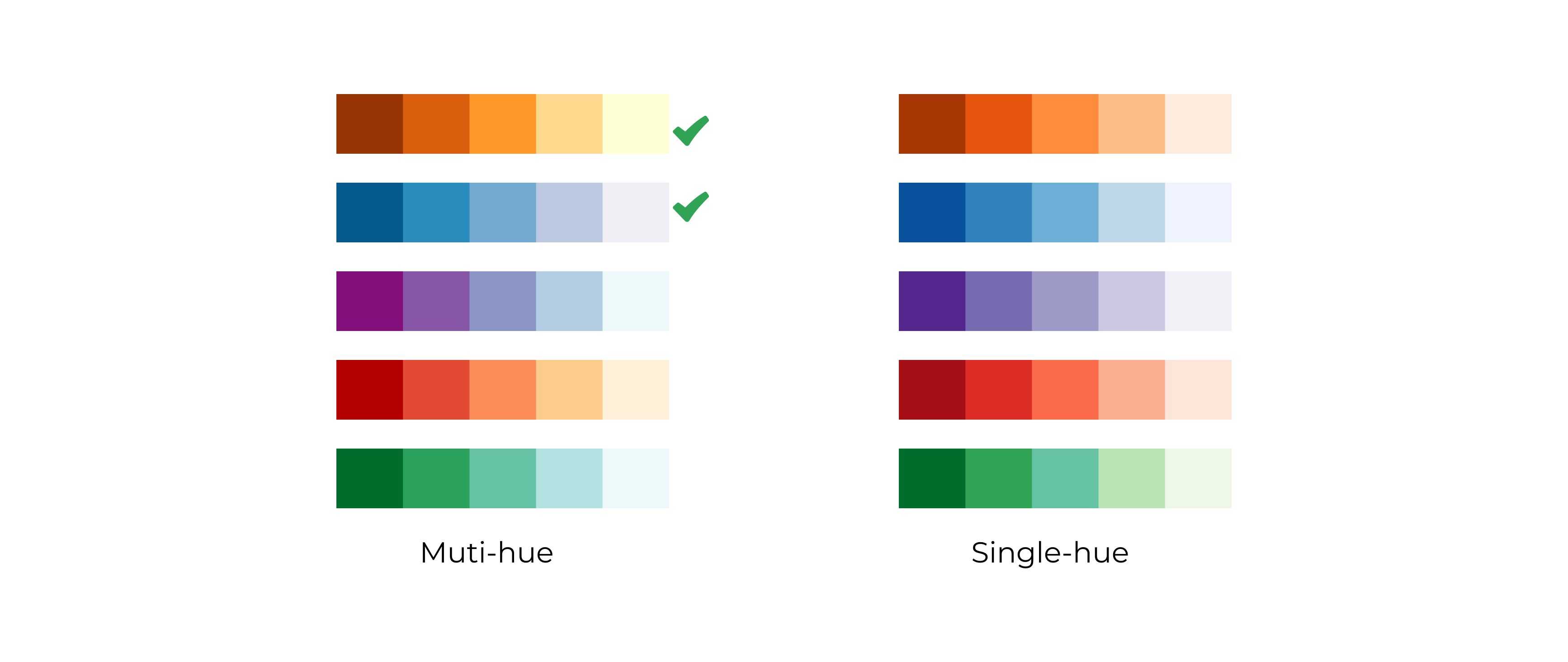
We selected a few color palettes from Color Brewer and chose to use an orange and blue multi-hue color scheme, which we then tested using a colorblind-friendly tool.
🎨 Why We Chose a Multi-Hue Color Palette
Enhanced Differentiation: Utilizing multiple hues allows for clearer distinction between categories, which is crucial for users with color vision deficiencies.
Improved Data Interpretation: Multi-hue palettes facilitate better understanding of categorical data by providing varied visual cues.
🟠🔵 Why We Used Orange and Blue
Avoiding Conflicts with Existing Maps: Green has already been used in other maps within the organization.
Psychological Impact: Orange is perceived as alerting without being as intense as red, making it suitable for highlighting important information.
High Contrast for Accessibility: The orange-blue combination offers strong contrast, aiding readability for individuals with color vision deficiencies.

The final map visualization employs an orange and blue color palette to clearly distinguish changes in the map view and data for users.
Improved Accessibility for Colorblind UsersThe high contrast of the orange and blue palette made it easier for colorblind users to distinguish data layers. During usability testing, fewer users had difficulty identifying and interpreting the data, leading to quicker and more accurate decision-making.Enhanced Data RecognitionThe distinct color separation helped users easily identify immunization and waiver data. As a result, in usability testing, users spent less time searching for the information, increasing overall map efficiency.
Streamlined User InteractionThe hover status allowed users to instantly see key data without clicking. In usability testing, this reduced confusion, with fewer users struggling to access detailed information.Simplified Visual ConsistencyUsing a unified marker shape created a clearer visual hierarchy. Usability testing showed that fewer users were distracted by inconsistent marker designs, allowing them to navigate the map more intuitively and efficiently.
